Installing MindTrek Countdown Timer on Wix
Follow the steps below to install MindTrek Countdown Timer on your Wix site:
Step 1
Open the Wix App Market and locate the MindTrek Countdown Timer app. Click Add to Site.
Step 2
Sign in to your Wix account if prompted. If you manage multiple sites, select the site where you want the app installed.
Step 3
Review the permissions and click Agree & Add to complete the installation. You will be redirected to the app dashboard.
Step 4
Select your preferred pricing plan. The app installs with the Free plan by default, and you can upgrade at any time.
Introduction
A countdown timer is a real-time visual indicator that shows how much time remains before a deal, event, or promotion ends. It helps drive urgency, improve engagement, and increase conversions by prompting visitors to act quickly.
Countdown Timer Types
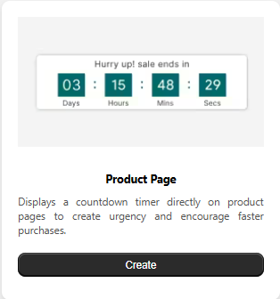
Product Page Timer
Appears directly on product pages to accelerate purchasing decisions and highlight time-sensitive offers.
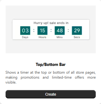
Top/Bottom Bar Timer
Displays a floating notification bar with a live countdown at the top or bottom of the website for maximum visibility.
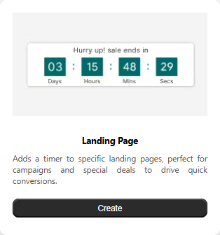
Landing Page Timer
Adds urgency to campaign and promotional pages by showing a deadline-driven countdown.
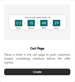
Cart Page Timer
Shows a timer during checkout to reduce hesitation and improve purchase completion rates.
Why Use Countdown Timers?
-
Create Urgency
Highlights limited-time availability, motivating shoppers to act quickly.
-
Boost Conversions
Speeds up decision-making and helps reduce cart abandonment.
-
Increase Engagement
Keeps visitors focused on your promotion while browsing your store.
-
Build Trust & Credibility
Professional-looking timers make your store feel active and reliable.
-
Accelerate Purchase Decisions
Reduces hesitation and encourages faster checkout completion.
-
Real-Time Countdown
Displays live time remaining in days, hours, minutes, and seconds.
-
Mobile-Friendly Design
Works smoothly across desktop, tablet, and mobile devices.
-
Flexible Placement
Can be shown on product pages, landing pages, or in the cart — wherever urgency matters most.
Product Page Timer
The Product Page Timer displays a live countdown directly on your product pages to create urgency and encourage faster purchase decisions. By adding time limits to offers, discounts, or special promotions, it helps increase customer engagement and improve conversion rates. The timer is fully customizable, allowing you to adjust its design, messaging, and behavior to match your brand identity and business goals. It supports time-based campaigns, improves visibility for limited-time deals, and functions seamlessly across all product pages. In this section, you’ll learn how to enable, configure, and optimize the Product Page Timer to enhance the shopping experience and drive better sales performance.
Setup Tab:
Timer Status
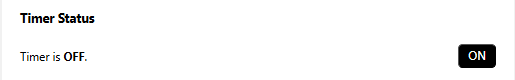
The product page timer is currently OFF and is not visible on your storefront.
Turn it ON to activate the timer and display it on eligible product pages based on your configured conditions.
Timer Settings
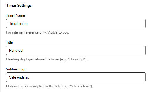
The Timer Settings section lets you control the text shown alongside the countdown on your product page. You can assign an internal label for easy management and customize the heading and supporting text that customers see.
Timer Name
An internal label used only for your reference. This name is not shown to customers and helps you identify the timer’s purpose.
Title
The main heading displayed above the countdown timer. Use a short, attention-grabbing message to create urgency.
Subheading
An optional line shown below the title to add context or reinforce the message, such as indicating when the offer expires.
Timer Labels
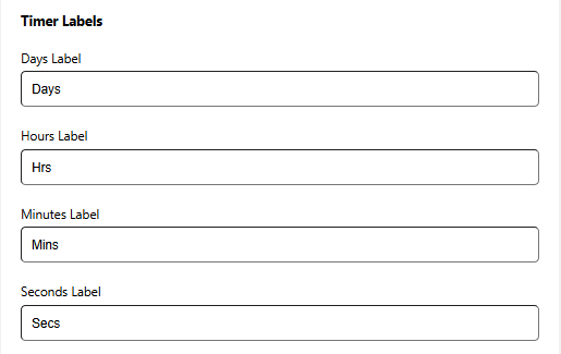
Use this section to customize the text shown beneath each time unit in the countdown timer. Adjusting these labels helps match your store’s tone and overall branding.
Days Label
Text displayed under the Days value in the timer.
Examples: Days, D
Hours Label
Text displayed under the Hours value in the timer.
Examples: Hours, H
Minutes Label
Text displayed under the Minutes value in the timer.
Examples: Minutes, M
Seconds Label
Text displayed under the Seconds value in the timer.
Examples: Seconds, S
Timer Behavior
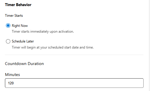
Configure when the countdown timer operates on your product page.
Timer Starts
Choose when the timer should begin.
-
Right Now
The timer activates immediately after it is turned on.
Countdown Duration
Set how long the countdown should run.
-
Minutes
Enter the total number of minutes for the countdown. For example, entering 120 will display a two-hour timer for visitors.
Timer Behavior
Control when your countdown timer becomes active on your product page.
Timer Starts
Select when the timer should begin.
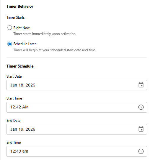
-
Schedule Later
The timer runs based on the start and end date and time you define.
Timer Schedule
Set the exact timeframe during which the timer will be displayed.
-
Start Date & Time
Choose when the countdown should begin.
-
End Date & Time
Select when the countdown should stop.
Action After Timer Ends
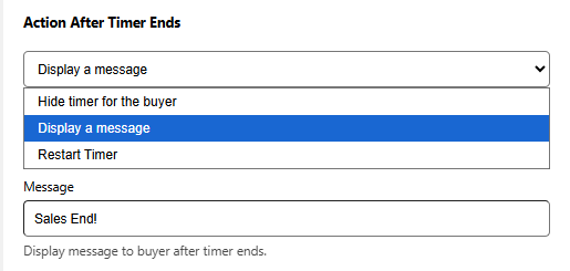
Choose what happens after the countdown finishes.
Hide timer for the buyer
The countdown will be removed from the product page once it reaches zero.
Display a message
Replace the countdown with a custom message to let customers know the offer has ended or direct them to another promotion.
-
Message
Enter the text that will be displayed after the timer expires.
Example: “This deal has ended, but more offers are coming soon!”
Restart Timer (Available for Right Now)
The timer restarts from the original duration for each new visitor session.
Appearance:
Background Settings
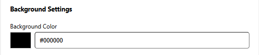
Select the background color for the countdown timer container so it blends seamlessly with your store’s design.
You can choose a color using the picker or enter a HEX value (for example, #FF5733) to apply an exact shade. A live preview updates instantly, allowing you to see how the background will look in real time.
Card Design
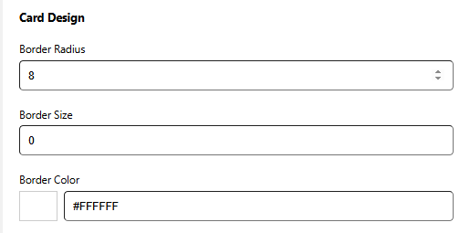
Customize the visual style of the timer card to match your store’s look and feel.
Border Radius
Controls how rounded the corners of the timer card appear.
Higher values result in softer, more rounded edges.
Example: 0px creates sharp corners, while 8px gives a gently rounded look.
Border Size
Defines the thickness of the card’s border.
Enter a value in pixels, such as 4px.
Use 0px if you prefer no border.
Border Color
Select the color used for the card border.
Choose a shade using the color picker or enter a HEX value (for example, #000000 for black).
Inside Spacing
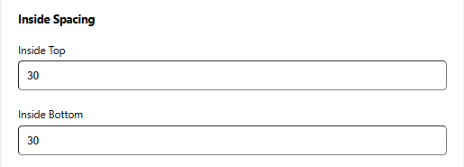
Adjust the padding inside the timer card to control the space around its content.
Inside Top
Defines the space between the top edge of the card and its inner content.
Measured in pixels, such as 10px.
Inside Bottom
Controls the space between the bottom edge of the card and its inner content.
Also measured in pixels, for example 12px.
Outside Spacing
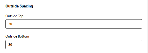
Control the space around the timer card to improve layout and visual balance on the product page.
Outside Top
Defines the space above the timer card.
Measured in pixels, such as 15px.
Outside Bottom
Sets the space below the timer card.
Also measured in pixels, for example 10px.
Typography Settings
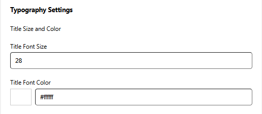
Customize how the title text appears above the countdown timer.
Title Font Size
Adjust the font size of the title text.
Values are measured in pixels, such as 20px.
Using a larger size helps the title stand out and grab attention.
Title Font Color
Select the color used for the title text.
Choose a shade with the color picker or enter a HEX value (for example, #333333).
For best readability, use a color that contrasts well with the background.
Subheading Size and Color
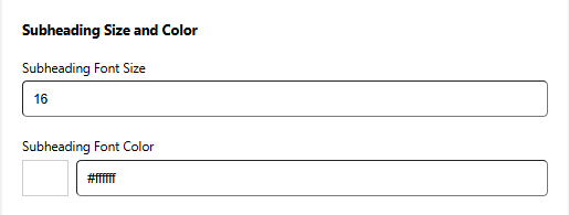
Control the appearance of the subheading text shown below the timer title.
Subheading Font Size
Adjust the font size of the subheading text.
Measured in pixels, such as 16px.
For best visual balance, use a size slightly smaller than the main title.
Subheading Font Color
Select the color used for the subheading text.
Choose a color with the picker or enter a HEX value (for example, #777777).
Choose a softer shade that enhances the title while keeping the focus on it.
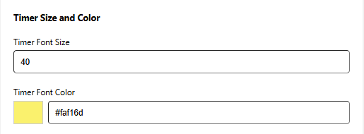
Timer Size and Color
Adjust the appearance of the countdown numbers to make them clear and attention-grabbing.
Timer Font Size
Control the font size of the timer digits.
Values are measured in pixels, such as 24px.
Larger numbers help highlight urgency and draw the shopper’s eye.
Timer Font Color
Select the color used for the countdown digits.
Choose a shade with the color picker or enter a HEX value (for example, #FF0000 for red).
For best results, use a color that contrasts well with the background and fits your store’s color scheme.
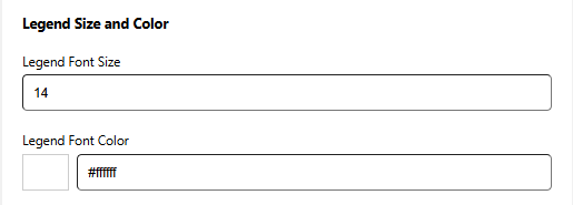
Legend Size and Color
Customize the appearance of the labels shown below the timer digits.
Legend Font Size
Adjust the font size of the legend text.
Measured in pixels, such as 14px.
Using a slightly smaller size than the timer numbers helps maintain visual balance.
Legend Font Color
Select the color used for the legend text.
Choose a color with the picker or enter a HEX value (for example, #555555).
Ensure the color is easy to read and works well with both the timer digits and the background.
Positioning:
Select Position
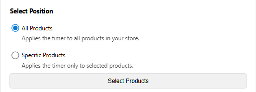
Decide which products in your store will display the countdown timer. This setting allows you to control exactly where the timer appears.
All Products
The timer will be shown on every product page in your store.
This option is ideal for storewide sales or flash promotions and requires no individual product selection.
Specific Products
The timer will appear only on the products you choose.
This is best for targeted or limited-time offers on selected items.
Use the product Selection to add the exact products where the timer should be displayed.
Custom Timer Integration
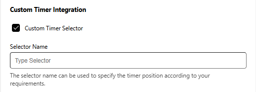
Enable this option to place the timer in a custom location on your product page using a selector.
Selector Name
Enter the selector you want to use to control where the timer appears on the page.
This allows you to position the timer according to your layout or design requirements.
Top/Bottom Bar Timer
The Top/Bottom Bar Timer is a floating notification bar that displays a real-time countdown at the top or bottom of your store pages. It’s built to immediately catch attention and motivate shoppers to act quickly on time-sensitive offers, flash deals, or special promotions.
You can customize every aspect of the timer bar including its text, design, behavior, and display conditions to align with your brand and sales strategy. Whether you prefer a subtle reminder or a bold promotional message, this feature helps increase conversions by reinforcing urgency as soon as visitors arrive.
In this guide, you’ll learn how to activate, customize, and effectively use the Top/Bottom Bar Timer to improve sales performance and deliver a better shopping experience.
Setup Tab:
Timer Status
The Top/Bottom Bar is currently OFF and is not visible on your storefront.
Turn it ON to activate the timer and display it on the website based on the conditions you’ve set.
Timer Settings
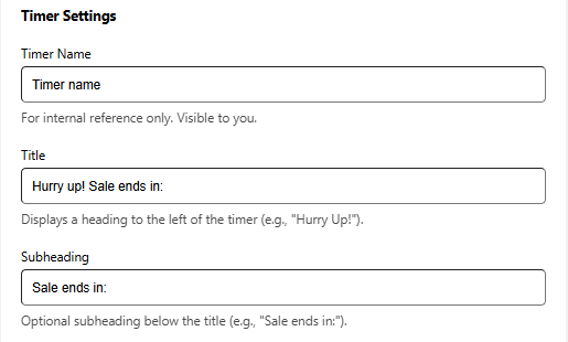
The Timer Settings section lets you control the text shown alongside the countdown on your website. You can assign an internal label for easy management and customize the heading and supporting text that customers see.
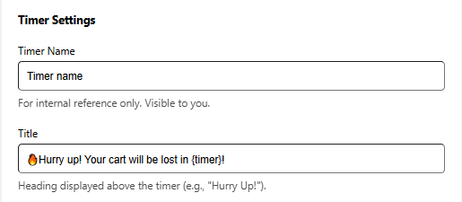
Timer Name
An internal label used only for your reference. This name is not shown to customers and helps you identify the timer’s purpose.
Title
The main heading displayed to the left of the timer. Use a short, attention-grabbing message to create urgency.
Subheading
An optional line shown below the title to add context or reinforce the message, such as indicating when the offer expires.
Action Configuration
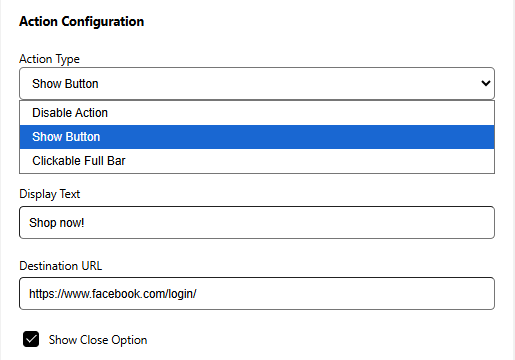
Control how your Top/Bottom Bar Timer responds when visitors interact with it. You can keep it purely informational or add clickable actions to guide users to the next step.
Disable Action
Displays the countdown and message only, with no clickable elements.
Show Button
Adds a clickable button to the timer bar.
Clickable Full Bar
Makes the entire timer bar clickable and redirects visitors to a chosen link.
Display Text (Available with Show Button)
Enter the label shown on the button. Examples: “Shop Now”, “View Deal”, “Explore Offer”
Destination URL (Available with Show Button & Clickable Full Bar)
Provide the destination link where users should be taken.This can link to a product, collection, discount page, or any custom URL. Supports full URLs starting with https://.
Show Close Option
Adjust the appearance of the dismiss (close) icon on your timer bar so it fits your store’s design and remains easy for customers to see.
Enable a small “X” icon that allows users to manually close the timer bar.
Timer Labels
Use this section to customize the text shown beneath each time unit in the countdown timer. Adjusting these labels helps match your store’s tone and overall branding.
Days Label
Text displayed under the Days value in the timer.
Examples: Days, D
Hours Label
Text displayed under the Hours value in the timer.
Examples: Hours, H
Minutes Label
Text displayed under the Minutes value in the timer.
Examples: Minutes, M
Seconds Label
Text displayed under the Seconds value in the timer.
Examples: Seconds, S
Timer Behavior
Configure when the countdown timer operates on your website.
Timer Starts
Choose when the timer should begin.
-
Right Now
The timer activates immediately after it is turned on.
Countdown Duration
Set how long the countdown should run.
-
Minutes
Enter the total number of minutes for the countdown. For example, entering 120 will display a two-hour timer for visitors.
Timer Behavior
Control when your countdown timer becomes active on your website.
Timer Starts
Select when the timer should begin.
-
Schedule Later
The timer runs based on the start and end date and time you define.
Timer Schedule
Set the exact timeframe during which the timer will be displayed.
-
Start Date & Time
Choose when the countdown should begin.
-
End Date & Time
Select when the countdown should stop.
Action After Timer Ends
Choose what happens after the countdown finishes.
Hide timer for the buyer
The countdown will be removed from the website once it reaches zero.
Display a message
Replace the countdown with a custom message to let customers know the offer has ended or direct them to another promotion.
-
Message
Enter the text that will be displayed after the timer expires.
Example: “This deal has ended, but more offers are coming soon!”
Restart Timer (Available for Right Now)
The timer restarts automatically after completion.
Appearance:
Background Settings
Select the background color for the countdown timer container so it blends seamlessly with your store’s design.
You can choose a color using the picker or enter a HEX value (for example, #FF5733) to apply an exact shade. A live preview updates instantly, allowing you to see how the background will look in real time.
Card Design
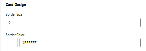
Customize the visual style of the timer card to match your store’s look and feel.
Border Size
Defines the thickness of the card’s border.
Enter a value in pixels, such as 4px.
Use 0px if you prefer no border.
Border Color
Select the color used for the card border.
Choose a shade using the color picker or enter a HEX value (for example, #000000 for black).
Inside Spacing
Adjust the padding inside the timer card to control the space around its content.
Inside Top
Defines the space between the top edge of the card and its inner content.
Measured in pixels, such as 10px.
Inside Bottom
Controls the space between the bottom edge of the card and its inner content.
Also measured in pixels, for example 12px.
Outside Spacing
Control the space around the timer card to improve layout and visual balance on the website.
Outside Top
Defines the space above the timer card.
Measured in pixels, such as 15px.
Outside Bottom
Sets the space below the timer card.
Also measured in pixels, for example 10px.
Typography Settings
Customize how the title text appears above the countdown timer.
Title Font Size
Adjust the font size of the title text.
Values are measured in pixels, such as 20px.
Using a larger size helps the title stand out and grab attention.
Title Font Color
Select the color used for the title text.
Choose a shade with the color picker or enter a HEX value (for example, #333333).
For best readability, use a color that contrasts well with the background.
Subheading Size and Color
Control the appearance of the subheading text shown below the timer title.
Subheading Font Size
Adjust the font size of the subheading text.
Measured in pixels, such as 16px.
For best visual balance, use a size slightly smaller than the main title.
Subheading Font Color
Select the color used for the subheading text.
Choose a color with the picker or enter a HEX value (for example, #777777).
Choose a softer shade that enhances the title while keeping the focus on it.
Timer Size and Color
Adjust the appearance of the countdown numbers to make them clear and attention-grabbing.
Timer Font Size
Control the font size of the timer digits.
Values are measured in pixels, such as 24px.
Larger numbers help highlight urgency and draw the shopper’s eye.
Timer Font Color
Select the color used for the countdown digits.
Choose a shade with the color picker or enter a HEX value (for example, #FF0000 for red).
For best results, use a color that contrasts well with the background and fits your store’s color scheme.
Legend Size and Color
Customize the appearance of the labels shown below the timer digits.
Legend Font Size
Adjust the font size of the legend text.
Measured in pixels, such as 14px.
Using a slightly smaller size than the timer numbers helps maintain visual balance.
Legend Font Color
Select the color used for the legend text.
Choose a color with the picker or enter a HEX value (for example, #555555).
Ensure the color is easy to read and works well with both the timer digits and the background.
Button Appearance
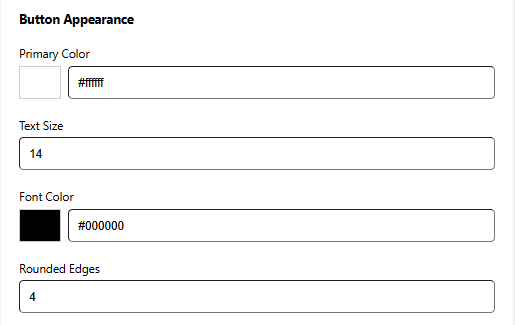
Customize the look of the action button on your Landing Page Timer so it fits your brand and draws attention effectively.
Primary Color
Set the button’s background color.
Choose a color that stands out against the timer bar, or use your brand’s primary color for visual consistency.
Text Size
Adjust the font size of the button label.
Make sure the text is easy to read without overpowering the design.
Match the size with your store’s typography for a cohesive look.
Font Color
Select the color of the button text.
Use a high-contrast color to ensure good readability.
Rounded Edges
Enable this option to add rounded corners to the button.
Higher values create smoother, more rounded edges.
Example: 0px for sharp corners, 12px for a softer appearance.
Icon Styling
Select the color of the “X” icon used to close the timer bar.
Choose a color that stands out against the bar background for better visibility. Example: light icon on a dark bar, or dark icon on a light bar.
Placement & Visibility
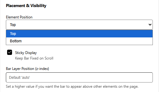
Control where the Top/Bottom Bar Timer is displayed on your storefront and how it behaves while shoppers scroll.
Element Position
Choose where the timer bar appears vertically on the page:
-
Top
Shows the timer bar at the top of the page.
-
Bottom
Shows the timer bar at the bottom of the page.
Sticky Display (Available with Top Position)
Enable this option to keep the timer bar fixed at the top of the screen as visitors scroll.This ensures the timer remains visible at all times, making it ideal for igh-priority or time-sensitive promotions.
Bar Layer Position (z-index)
Adjust the z-index value if the timer bar overlaps or gets hidden by other elements on your site.
Higher values bring the bar in front of other content (for example, 9999).
This is helpful if headers, popups, or other overlays are covering the timer bar.
Positioning:
Select Position
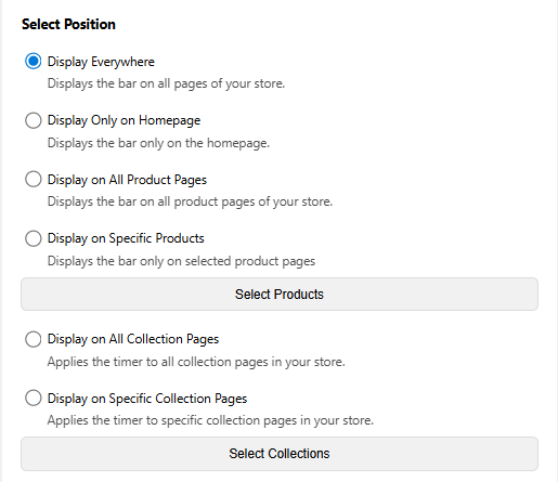
This setting allows you to control exactly where the timer appears.
Display Everywhere
Displays the timer bar across your entire store, including the homepage, product pages, collection pages, cart, and more.
Display Only on Homepage
Limits the timer bar to the homepage.
This is ideal for announcing storewide offers or general promotions.
Display on All Product Pages
Displays the timer bar on every product page in your store.
Display on Specific Products
Allows you to choose specific products where the timer bar will appear.
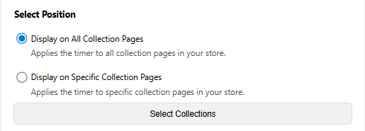
Display on All Collection Pages
Displays the timer bar on all collection pages.
Display on Specific Collection Pages
Lets you select individual collections where the timer bar should be visible.
Custom Timer Integration
Enable this option to place the timer in a custom location on your product page using a selector.
Selector Name
Enter the selector you want to use to control where the timer appears on the page.
This allows you to position the timer according to your layout or design requirements.
Landing Page Timer
The Landing Page Timer helps increase urgency and improve conversions on dedicated campaign and promotional pages. It’s ideal for use cases like flash sales, product releases, or time-bound offers, where encouraging quick action is essential.
With flexible customization options, you can tailor the countdown to match your campaign’s messaging and visual style. Everything—from text and design to placement and timing behavior—can be adjusted to fit the layout and goals of your landing page.
In this guide, you’ll learn how to activate, customize, and effectively use the Landing Page Timer to drive conversions and improve the overall visitor experience.
Setup Tab:
Timer Status
The product page timer is currently OFF and is not visible on your storefront.
Turn it ON to activate the timer and display it on eligible product pages based on your configured conditions.
Timer Settings
The Timer Settings section lets you control the text shown alongside the countdown on your product page. You can assign an internal label for easy management and customize the heading and supporting text that customers see.
Timer Name
An internal label used only for your reference. This name is not shown to customers and helps you identify the timer’s purpose.
Title
The main heading displayed above the countdown timer. Use a short, attention-grabbing message to create urgency.
Subheading
An optional line shown below the title to add context or reinforce the message, such as indicating when the offer expires.
Action Configuration
Control how your Top/Bottom Bar Timer responds when visitors interact with it. You can keep it purely informational or add clickable actions to guide users to the next step.
Disable Action
Displays the countdown and message only, with no clickable elements.
Show Button
Adds a clickable button to the timer bar.
Clickable Full Bar
Makes the entire timer bar clickable and redirects visitors to a chosen link.
Display Text (Available with Show Button)
Enter the label shown on the button. Examples: “Shop Now”, “View Deal”, “Explore Offer”
Destination URL (Available with Show Button & Clickable Full Bar)
Provide the destination link where users should be taken.This can link to a product, collection, discount page, or any custom URL. Supports full URLs starting with https://.
Timer Labels
Use this section to customize the text shown beneath each time unit in the countdown timer. Adjusting these labels helps match your store’s tone and overall branding.
Days Label
Text displayed under the Days value in the timer.
Examples: Days, D
Hours Label
Text displayed under the Hours value in the timer.
Examples: Hours, H
Minutes Label
Text displayed under the Minutes value in the timer.
Examples: Minutes, M
Seconds Label
Text displayed under the Seconds value in the timer.
Examples: Seconds, S
Timer Behavior
Configure when the countdown timer operates on your product page.
Timer Starts
Choose when the timer should begin.
-
Right Now
The timer activates immediately after it is turned on.
Countdown Duration
Set how long the countdown should run.
-
Minutes
Enter the total number of minutes for the countdown. For example, entering 120 will display a two-hour timer for visitors.
Timer Behavior
Control when your countdown timer becomes active on your product page.
Timer Starts
Select when the timer should begin.
-
Schedule Later
The timer runs based on the start and end date and time you define.
Timer Schedule
Set the exact timeframe during which the timer will be displayed.
-
Start Date & Time
Choose when the countdown should begin.
-
End Date & Time
Select when the countdown should stop.
Action After Timer Ends
Choose what happens after the countdown finishes.
Hide timer for the buyer
The countdown will be removed from the product page once it reaches zero.
Display a message
Replace the countdown with a custom message to let customers know the offer has ended or direct them to another promotion.
-
Message
Enter the text that will be displayed after the timer expires.
Example: “This deal has ended, but more offers are coming soon!”
Restart Timer (Available for Right Now)
The timer restarts from the original duration for each new visitor session.
Appearance:
Background Settings
Select the background color for the countdown timer container so it blends seamlessly with your store’s design.
You can choose a color using the picker or enter a HEX value (for example, #FF5733) to apply an exact shade. A live preview updates instantly, allowing you to see how the background will look in real time.
Card Design
Customize the visual style of the timer card to match your store’s look and feel.
Border Radius
Controls how rounded the corners of the timer card appear.
Higher values result in softer, more rounded edges.
Example: 0px creates sharp corners, while 8px gives a gently rounded look.
Border Size
Defines the thickness of the card’s border.
Enter a value in pixels, such as 4px.
Use 0px if you prefer no border.
Border Color
Select the color used for the card border.
Choose a shade using the color picker or enter a HEX value (for example, #000000 for black).
Inside Spacing
Adjust the padding inside the timer card to control the space around its content.
Inside Top
Defines the space between the top edge of the card and its inner content.
Measured in pixels, such as 10px.
Inside Bottom
Controls the space between the bottom edge of the card and its inner content.
Also measured in pixels, for example 12px.
Outside Spacing
Control the space around the timer card to improve layout and visual balance on the product page.
Outside Top
Defines the space above the timer card.
Measured in pixels, such as 15px.
Outside Bottom
Sets the space below the timer card.
Also measured in pixels, for example 10px.
Typography Settings
Customize how the title text appears above the countdown timer.
Title Font Size
Adjust the font size of the title text.
Values are measured in pixels, such as 20px.
Using a larger size helps the title stand out and grab attention.
Title Font Color
Select the color used for the title text.
Choose a shade with the color picker or enter a HEX value (for example, #333333).
For best readability, use a color that contrasts well with the background.
Subheading Size and Color
Control the appearance of the subheading text shown below the timer title.
Subheading Font Size
Adjust the font size of the subheading text.
Measured in pixels, such as 16px.
For best visual balance, use a size slightly smaller than the main title.
Subheading Font Color
Select the color used for the subheading text.
Choose a color with the picker or enter a HEX value (for example, #777777).
Choose a softer shade that enhances the title while keeping the focus on it.
Timer Size and Color
Adjust the appearance of the countdown numbers to make them clear and attention-grabbing.
Timer Font Size
Control the font size of the timer digits.
Values are measured in pixels, such as 24px.
Larger numbers help highlight urgency and draw the shopper’s eye.
Timer Font Color
Select the color used for the countdown digits.
Choose a shade with the color picker or enter a HEX value (for example, #FF0000 for red).
For best results, use a color that contrasts well with the background and fits your store’s color scheme.
Legend Size and Color
Customize the appearance of the labels shown below the timer digits.
Legend Font Size
Adjust the font size of the legend text.
Measured in pixels, such as 14px.
Using a slightly smaller size than the timer numbers helps maintain visual balance.
Legend Font Color
Select the color used for the legend text.
Choose a color with the picker or enter a HEX value (for example, #555555).
Ensure the color is easy to read and works well with both the timer digits and the background.
Button Appearance
Customize the look of the action button on your Landing Page Timer so it fits your brand and draws attention effectively.
Primary Color
Set the button’s background color.
Choose a color that stands out against the timer bar, or use your brand’s primary color for visual consistency.
Text Size
Adjust the font size of the button label.
Make sure the text is easy to read without overpowering the design.
Match the size with your store’s typography for a cohesive look.
Font Color
Select the color of the button text.
Use a high-contrast color to ensure good readability.
Rounded Edges
Enable this option to add rounded corners to the button.
Higher values create smoother, more rounded edges.
Example: 0px for sharp corners, 12px for a softer appearance.
Positioning:
Select Position
Decide where your Landing Page Timer should be displayed in your Wix store. You can show it across multiple page types or limit it to specific locations, giving you complete control over visibility.
Display on All Collection Pages
The timer will appear on every collection page in your store.
This option works well for storewide collection campaigns, seasonal promotions, or flash sales.
Display on Specific Collection Pages
The timer will be displayed only on the collection pages you choose.
Ideal for time-limited offers focused on specific product categories or groups.
Custom Timer Integration
Enable this option to place the timer in a custom location on your product page using a selector.
Selector Name
Enter the selector you want to use to control where the timer appears on the page.
This allows you to position the timer according to your layout or design requirements.
Cart Page Timer
The Cart Page Timer adds urgency at the most critical point of the shopping experience—the cart. By showing a live countdown during checkout, it encourages customers to complete their purchase sooner, helping reduce drop-offs and improve conversion rates.
This timer works well for limited-time deals, short hold periods, or urgency-based messaging that pushes shoppers toward action. It’s an effective way to remind customers that time-sensitive benefits won’t last forever.
With full control over content, styling, placement, and behavior, the Cart Page Timer lets you fine-tune the experience and drive conversions when purchase decisions matter most.
Setup Tab:
Timer Status
The cart page timer is currently OFF and is not visible on your storefront.
Turn it ON to activate the timer and display it on cart page based on your configured conditions.
Timer Settings
The Timer Settings section lets you control the text shown alongside the countdown on your cart page. You can assign an internal label for easy management and customize the heading and supporting text that customers see.
Timer Name
An internal label used only for your reference. This name is not shown to customers and helps you identify the timer’s purpose.
Title
The main message displayed on the cart page alongside the countdown timer.
You can include dynamic placeholders to show real-time countdown values within the text, helping reinforce urgency and encourage faster checkout.
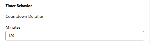
Timer Behavior
Configure when the countdown timer operates on your cart page.
Countdown Duration
Set how long the countdown should run.
-
Minutes
Enter the total number of minutes for the countdown. For example, entering 120 will display a two-hour timer for visitors.
Action After Timer Ends
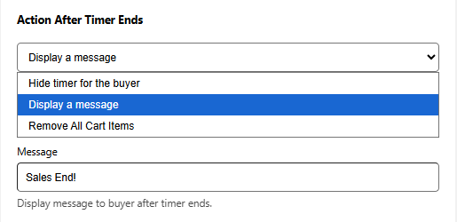
Choose what should occur once the countdown finishes. This setting helps you control urgency and influence how shoppers behave at the final stage of checkout.
Hide timer for the buyer
When the timer reaches zero, it is removed from the cart page.
The shopper’s cart stays intact, allowing them to continue browsing or proceed to checkout without interruption.
Display a message
Replace the countdown with a custom message to let customers know the offer has ended or direct them to another promotion.
-
Message
Enter the text that will be displayed after the timer expires.
Example: “This deal has ended, but more offers are coming soon!”
Remove All Cart Items
When the timer expires, all items are removed from the shopper’s cart.
This is the most strict option and works best for high-demand products or time-based reservation offers where availability is limited.
Appearance:
Background Settings
Select the background color for the countdown timer container so it blends seamlessly with your store’s design.
You can choose a color using the picker or enter a HEX value (for example, #FF5733) to apply an exact shade. A live preview updates instantly, allowing you to see how the background will look in real time.
Card Design
Customize the visual style of the timer card to match your store’s look and feel.
Border Radius
Controls how rounded the corners of the timer card appear.
Higher values result in softer, more rounded edges.
Example: 0px creates sharp corners, while 8px gives a gently rounded look.
Border Size
Defines the thickness of the card’s border.
Enter a value in pixels, such as 4px.
Use 0px if you prefer no border.
Border Color
Select the color used for the card border.
Choose a shade using the color picker or enter a HEX value (for example, #000000 for black).
Inside Spacing
Adjust the padding inside the timer card to control the space around its content.
Inside Top
Defines the space between the top edge of the card and its inner content.
Measured in pixels, such as 10px.
Inside Bottom
Controls the space between the bottom edge of the card and its inner content.
Also measured in pixels, for example 12px.
Outside Spacing
Control the space around the timer card to improve layout and visual balance on the cart page.
Outside Top
Defines the space above the timer card.
Measured in pixels, such as 15px.
Outside Bottom
Sets the space below the timer card.
Also measured in pixels, for example 10px.
Typography Settings
Customize how the title text appears above the countdown timer.
Title Font Size
Adjust the font size of the title text.
Values are measured in pixels, such as 20px.
Using a larger size helps the title stand out and grab attention.
Title Font Color
Select the color used for the title text.
Choose a shade with the color picker or enter a HEX value (for example, #333333).
For best readability, use a color that contrasts well with the background.
Timer Size and Color
Adjust the appearance of the countdown numbers to make them clear and attention-grabbing.
Timer Font Size
Control the font size of the timer digits.
Values are measured in pixels, such as 24px.
Larger numbers help highlight urgency and draw the shopper’s eye.
Timer Font Color
Select the color used for the countdown digits.
Choose a shade with the color picker or enter a HEX value (for example, #FF0000 for red).
For best results, use a color that contrasts well with the background and fits your store’s color scheme.
Positioning:
Select Position
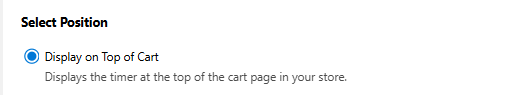
Choose where the Cart Page Timer appears within your cart layout. This allows you to control how noticeable the countdown is for shoppers.
Display on Top of Cart
The timer is automatically placed at the top of the cart page, with no setup or coding required.
This highly visible position is recommended to maximize urgency and encourage faster checkout.
Custom Timer Integration
Enable this option to place the timer in a custom location on your cart page using a selector.
Selector Name
Enter the selector you want to use to control where the timer appears on the page.
This allows you to position the timer according to your layout or design requirements.